And this is my best attempt yet at drawing out a legible, useful and atmospheric map for The Reeking Metropolis – out by the end of the year.
One thing I love about maps is the density of information – but that is also one of the things that makes them hard to create! This is very heavily based on the Ordnance Survey 1885-1900 One Inch map of London, available online courtesy of the National Library of Scotland. It’s not a copy or a screenshot, but a digital tracing, with my own exaggeration of the most important routes through the city for a desperate velosteamer.
It also includes my first attempt at using icons for several of the most important locations. Yes, I did begin with the pubs (which are almost completely written).
I had made a few prior attempts, but this seems to work because of the negative space around the irregular city ‘blocks’, which indicates the main roads and gives an impression of a much more complex city. Once again, like with every volume I’ve written so far, I’ve realised that I could have chosen a much smaller area for the reader to explore and still had a jam-packed book. So be it: I guess everyone writing open-world gamebooks (all 2/3 of us currently?) must feel like this. @Paul Gresty? @Oliver Hulme?
Anyway, I’d love some feedback from readers of Steam Highwayman. What works for you with the current maps in Smog and Ambuscade and Highways and Holloways? I’ve received some criticisms that these need more labels. Do you agree? Does every location – small and large – need to be identified on the map? Is that what you want in a map? And then, if you’re a backer who pledged for the large maps, do you feel the same? Please give me your views. Perhaps you have some specific critiques of the map above – or something that you think has to be included?


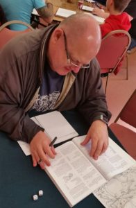
 It was a very pleasant day, introducing hardened DnDers to a solo, steampunk roleplaying experience, spending time with some faithful backers, including Colin Oaten, SH2 Backer 12, who lost himself in the proofing version of SH2 for over an hour, preying on the locobuses near Woodcote and failing to smooth-talk his way into Wallingford. I also met – in the flesh – several members of the gamebook community, including Sam Iacob, author of the